Deconstructing a pattern: The making of Hanbury
Kate Farley is the author of Repeat Printed Pattern for Interiors and Associate Professor in Design at Norwich University of the Arts in the UK. Here she walks us through the creation of her Hanbury pattern, which is part of her Plot to Plate collection. We hope this might help inspire you to undertake your own experiments with repeat pattern design!

In this blog post I will take you through my design process for creating the pattern Hanbury, in order to demonstrate the decisions I made along the way. I have chosen this particular pattern as it is fairly complex, with many different elements to it, including large and small motifs that work together to provide balance, rhythmic variation, visual interest and decoration.
With this project, my aim was to create a design based on a traditional pattern structure containing circular interlocking motifs, inspired by flocked wallpaper I had seen at Hanbury Hall, a National Trust property in Worcestershire, England.
At the time, I was creating my Plot to Plate pattern collection inspired by allotments and vegetable plots, but I wanted to include formal gardens, making a link between traditional garden design and textile design. I sketched flower borders as well as kitchen gardens to generate motifs and composition ideas. I did not want to create a pattern that was recognizable as a garden, with obvious flowers and borders, but rather an interpretation.
I began by creating diagrams investigating the circular structure with the motifs I had drawn, building up areas of detail alongside textured micro patterns in my sketchbook. I initially focused on designing a tile of one full circle and four quarter circles that could be repeated to create larger areas of pattern.
Once I had developed the first draft of the pattern, I scanned the artwork and roughly placed it in a full-drop repeat to get a sense of scale in the motifs, and the overall visual rhythms.

Lino printing provided the visual language as I had done in previous patterns in Plot to Plate. Although linocutting can create a textural quality, I wanted to use it for the clean graphic quality, referencing back to the graphic motifs at Hanbury Hall. I cut the lino block and printed the first iteration of the design, scanning the black-on-white print to further test the repeating rhythms digitally. There were elements that stood out, particularly the petal-like motifs around the four quarter circles; in repeat they were too obvious in comparison with the other details. By making them smaller and adding more, the impact of each petal was reduced.

I then wanted to add greater variation by adding more patterned texture, so I removed one of the circular motifs and replaced it with a rectangular form set inside a large circle. I also added more visual texture in small micro patterns. I created larger repeating areas of both new developments digitally to check the growing rhythm. Both patterns felt noisy and stilted, with some areas appearing too dominant. The pattern was lacking finesse and satisfactory detail, so more work was needed.

When I design, I tend to create artwork using drawing or printmaking, then scan motifs to further manipulate the design digitally. This image shows some individual motifs I moved about in Adobe Photoshop to test details of the design. I use guides to ensure the alignment of motifs, as in a geometric design any misplaced motif may appear more obvious when repeated across a large wall. I only digitally tidy up and clean small details of my lino printing as I don’t want it to appear too precise. I could have created an accurate graphic pattern using Adobe Illustrator but signs of irregularity in the hand-cut artwork are more interesting.

I had to consider the manufacturing processes available for wallpaper printing, wanting something more traditional than digital printing. I chose flexographic printing, which works as a relief print method, suiting the aesthetic of my artwork. The process involves printing from a circular cylinder holding the raised artwork, so the design needs to be 52 cm wide for the standard width of wallpaper, and the circumference of the roller was 53 cm, therefore determining the repeat tile size. A ground colour is applied, then the single-coloured pattern printed. With this knowledge I could ensure all artwork met the manufacturer’s specification as I progressed.
Although it took me a while to place all the star-like motifs and repeat the tile in the versions shown here, the overall pattern still felt too fussy, so I removed some of those motifs. Scale and weight of motifs, as well as relationships between motifs, can control the spirit of the pattern.

The two tiles shown in the image below appear very similar on first sight, but by swapping out two of the circles and adding hexagons as alternating motifs in the right-hand version, the design holds much more interest and the repeating tile is larger. The hexagon provides more dynamism with the straight edges in contrast to all the circles. They would alternate across the design, altering the overall rhythm.

This was an exciting development that resulted in a more interesting repeating composition. I had created this new shape by linocutting a new motif, scanning the print in the same way as all the other motifs, so it belonged. The dotted crossed lines within the hexagon linked to the dots in the central circular motif on a diagonal axis, to lead the eye from motif to motif. I removed the horizontal row of Vs and added vertical curves, again to lead the eye from shape to shape and increase variation. In the middle of the larger circular forms, I swapped every other central motif to include one with a lighter background in contrast to the existing darker one. This is a tiny detail, but adds visual interest and results in a larger repeating tile.
It is important to test a pattern to see how it flows across a large area if designing for interior surfaces. I therefore printed the pattern at full-scale and lived with it in the studio to see how details and overall pattern repeat appeared as I grew more familiar with it over time. I tested colours by painting gouache swatches and looked at them under various lighting conditions at different times of day and night. I had to specify the ground colour and the printed colour for manufacturing, and sent the printer the paint swatches as well as Pantone references.

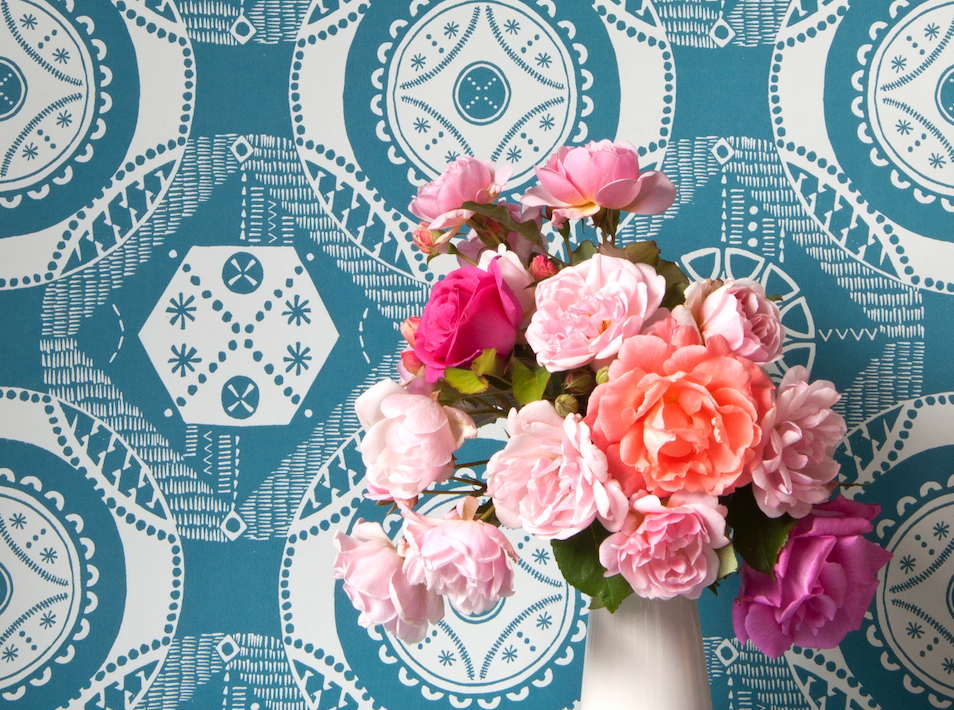
The final wallpaper has a calm pale-blue base colour, over-printed with a chalky teal colour.

Kate Farley
To receive 25% off Bloomsbury’s Textiles books, use the below discount codes (location dependent) at the checkout. Valid until the end of April 2023. You can browse our full list of titles here.
UK: SELVEDGE25
USA: SELVEDGE25US
CAN: SELVEDGE25CA
AUS: SELVEDGE25AU